Introduction to Responsive Design
Responsive design is a crucial approach in modern web development that allows web pages to render well on a variety of devices and window or screen sizes. This methodology enables a seamless user experience regardless of whether a visitor is accessing the site through a desktop computer, tablet, or smartphone. By employing responsive design techniques, developers create fluid layouts that adjust and adapt to the screen size, orientation, and resolution of the device being used.
The importance of responsive design cannot be overstated, as it directly impacts user engagement and satisfaction. In an era where mobile browsing increasingly surpasses traditional desktop browsing, ensuring that websites are visually appealing and functional on all devices is essential. A responsive web layout not only enhances usability but also impacts search engine optimization (SEO) rankings, as search engines favor mobile-friendly sites. This adaptability leads to improved performance and user retention, as visitors are more likely to stay on a site that accommodates their specific device needs.
Moreover, responsive design employs a variety of tactics and tools to achieve these flexible layouts, such as media queries, flexible grids, and fluid images. These components work together to ensure that all visual and interactive elements adjust proportionally to their viewing environment. For instance, a simple grid system allows content to rearrange itself as additional columns stack on smaller screens, ensuring that important information remains accessible and the overall aesthetic remains intact.
As the demand for a diverse array of devices continues to grow, responsive design has become an essential skill for web developers. It is not merely a trend but a fundamental requirement in delivering an optimal user experience across different platforms. Hence, mastering responsive design techniques, particularly CSS Flexbox and Grid, is critical in crafting modern, user-friendly websites.
Understanding Flexbox
The Flexbox layout model, also known as the Flexible Box Layout, is a powerful tool in CSS for designing responsive web applications. Flexbox simplifies the process of arranging elements within a container, providing greater control over alignment, direction, and order. Unlike traditional box models, Flexbox allows developers to create layouts that adapt seamlessly to various screen sizes and orientations, enhancing the user experience on all devices.
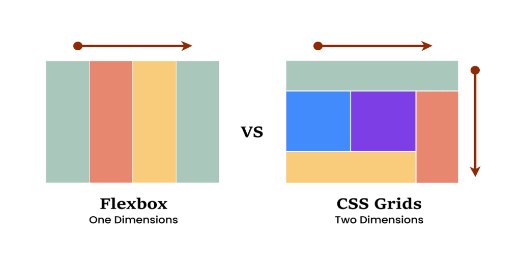
At its core, Flexbox enables the distribution of space along a single axis (either horizontal or vertical), making it ideal for one-dimensional layouts. This model consists of a flex container and its flex items. By applying the display property with the value of flex to a container, the contained elements become flex items, which can then be manipulated through various CSS properties. Key properties include justify-content, which manages horizontal alignment, and align-items, which controls vertical alignment.
Flexbox also allows for the adjustment of the direction of items within a flex container. The flex-direction property can arrange items in a row or column, accommodating different layout needs. Moreover, the flex-wrap property enables items to wrap onto multiple lines if they exceed the container’s width, preventing overflow and maintaining aesthetic integrity.
Another significant aspect of Flexbox is the ability to control the order of items without altering their source code using the order property. This feature is particularly advantageous for responsive design, as it enables developers to rearrange elements based on different breakpoints, thereby improving the visual flow of a webpage. Overall, mastering Flexbox is essential for any web developer aiming to create flexible, responsive designs that remain user-friendly across diverse platforms.
Basic Flexbox Example
To illustrate the fundamental concepts of Flexbox, let us create a responsive navigation bar. This navigation bar will adapt to various screen sizes, showcasing the versatility of the Flexbox layout model. Below is the HTML structure needed for the navigation bar.
<nav class="navbar"><div class="logo">My Website</div><ul class="nav-links"><li><a href="#home">Home</a></li><li><a href="#services">Services</a></li><li><a href="#about">About</a></li><li><a href="#contact">Contact</a></li></ul></nav>This simple structure contains a navigation bar with a logo and links. To apply Flexbox, we will now add the associated CSS styles. The following codes will achieve our goal of a responsive design.
.navbar {display: flex;justify-content: space-between;align-items: center;padding: 10px 20px;background-color: #333;color: white;}.nav-links {display: flex;list-style: none;}.nav-links li {margin: 0 15px;}.nav-links a {color: white;text-decoration: none;}@media (max-width: 600px) {.nav-links {flex-direction: column;align-items: center;margin-top: 10px;}.nav-links li {margin: 5px 0;}}In this CSS example, we initiate Flexbox on the navbar with the property display: flex, effectively arranging its children in a flexible layout. The justify-content and align-items properties help in centering and distributing space among elements. Furthermore, by using a media query, we ensure that the navigation bar transforms into a column layout on smaller screens, enhancing user experience. This example showcases the power of Flexbox in creating responsive designs that are both practical and aesthetically pleasing.
Introduction to CSS Grid
The CSS Grid layout system represents a fundamental evolution in web design, offering unparalleled versatility for creating complex web layouts. Unlike traditional layout methods, CSS Grid allows designers to create two-dimensional layouts according to a defined grid structure. This system organizes content into rows and columns, providing an intuitive way to align items on a webpage. By leveraging CSS Grid, developers can precisely control every aspect of their layout, ensuring that designs are both aesthetically pleasing and functional.
At its core, CSS Grid is defined by its grid container, which houses grid items. A grid is essentially a series of intersecting lines vertically and horizontally, allowing creators to specify where each item should be placed, thereby eliminating the need for complex floating techniques or excessive margins. Key concepts, such as grid rows and columns, serve as the building blocks of this layout system. Rows are created by defining the horizontal lines in the grid, while columns are established through vertical lines. By manipulating these elements, developers can partition their space into distinct areas that can be filled with various content types.
Another important feature of CSS Grid is its ability to define named grid areas. This allows for clearer organization and enhances the maintainability of the code. A named grid area can be applied to specific content, making it easier to identify which section belongs where, especially in intricate layouts. While CSS Grid excels in handling two-dimensional layouts, it complements the one-dimensional capabilities of Flexbox. By integrating both systems, developers can achieve seamless responsiveness across different screen sizes and resolutions, catering to a wide range of devices.
Basic CSS Grid Example
To illustrate how to effectively implement CSS Grid, we will explore a simple yet functional responsive image gallery. This example utilizes the grid layout feature, which allows us to create a structured and visually appealing presentation of images while enabling flexibility based on the viewport size. CSS Grid operates on the principles of rows and columns, which facilitates responsive design.
We will begin by setting up our HTML structure. Here is a straightforward example:
<div class="gallery"><img src="image1.jpg" alt="Image 1"><img src="image2.jpg" alt="Image 2"><img src="image3.jpg" alt="Image 3"><img src="image4.jpg" alt="Image 4"><img src="image5.jpg" alt="Image 5"><img src="image6.jpg" alt="Image 6"></div>With that HTML set up, we can now proceed to the CSS styling. In our CSS file, we will define the grid layout with the following code:
.gallery {display: grid;grid-template-columns: repeat(auto-fill, minmax(150px, 1fr));gap: 10px;}.gallery img {width: 100%;height: auto;border-radius: 8px;}This CSS snippet sets the display property to grid, signaling the browser to treat the `.gallery` class as a grid container. The property `grid-template-columns: repeat(auto-fill, minmax(150px, 1fr));` ensures that the grid adjusts itself based on the viewport width, filling the available space with images that have a minimum width of 150 pixels and a maximum of one fraction of the total width, creating a responsive image layout.
The result is a visually appealing gallery that dynamically adapts to various screen sizes, showcasing the amazing capabilities of CSS Grid in creating responsive designs. With these foundational principles, developers can further explore more complex layouts using CSS Grid, enhancing their website’s aesthetic and functional appeal.
Comparing Flexbox and Grid
Flexbox and Grid are two powerful CSS layout systems that address different design challenges, allowing web developers to create responsive layouts with ease. While both aim to simplify layout design, their core functionalities differ significantly, which influences how and when each should be employed.
Flexbox, or the Flexible Box Layout, is best suited for one-dimensional layouts. It excels in managing space distribution between items in a single row or column, making it ideal for components such as navigation menus, toolbars, or any layout that requires alignment along a single axis. With Flexbox, items can automatically adjust their size, allowing for a seamless adaptation across various screen sizes. It is particularly advantageous when the design requires dynamic changes in the content size or order as Flexbox provides robust tools for alignment, justification, and spacing between elements.
On the other hand, Grid offers a two-dimensional layout system that allows developers to manage both rows and columns simultaneously. It is well-suited for more complex layouts where the positioning of items is critical. Grid provides greater control when defining the overall structure of a page, enabling the setting of specific areas for content placement. This flexibility makes it a go-to choice for grid-based designs, such as image galleries, dashboards, or any layout that involves overlapping elements or specific alignment requirements.
It is important to emphasize that while Flexbox and Grid can be used independently, they are not mutually exclusive. In fact, using them together can yield optimal results. For example, a grid can define the layout of a page, while Flexbox can manage the alignment of items within a specific grid area. Understanding the strengths of each system ensures developers can effectively utilize their advantages, thereby creating harmonious and responsive designs. Choosing between Flexbox and Grid ultimately depends on the specific requirements of the project at hand.
Tips for Effective Responsive Design
Responsive design is a crucial aspect of modern web development, enabling websites to adapt seamlessly to various screen sizes and devices. One of the foundational principles of effective responsive design is the mobile-first approach. By prioritizing the mobile experience, designers ensure that the essential features of a website are accessible on smaller screens before enhancing the layout for larger displays. This strategy not only improves usability on mobile devices but also compels a streamlined design that focuses on core functionalities.
Media queries play an integral role in achieving responsive design by allowing styles to be applied based on the characteristics of the device, such as its width, height, orientation, and resolution. Implementing media queries enables designers to alter layouts, font sizes, and other visual elements, creating a tailored experience for each device. It is essential to utilize breakpoints strategically; they should correspond to the content’s needs rather than arbitrary screen sizes. This consideration ensures that the design is not only visually appealing but also functional across different devices.
Testing is indispensable in the responsive design process. It is vital to check how layouts render on various devices, including smartphones, tablets, and desktops, as well as across different browsers. Emulators and testing tools can be useful; however, real device testing often uncovers issues that simulators may not detect. It is advisable to involve real users in the testing phase, as their feedback can provide invaluable insights into usability and functionality. Ensuring that your design accommodates various screen sizes and orientations, while maintaining an intuitive user experience, will ultimately lead to a more successful online presence.
Common Challenges in Responsive Design
Responsive design has become an essential component of modern web development due to the proliferation of devices with varying screen sizes and resolutions. However, developers often encounter specific challenges when attempting to implement effective responsive layouts using methods such as Flexbox and Grid. Understanding these obstacles is critical for creating a seamless user experience.
One of the prominent challenges is performance, particularly regarding load times. Large images and unoptimized resources can significantly slow down a responsive website, especially on mobile devices. To address this, developers should employ techniques such as lazy loading, responsive images using the `srcset` attribute, and minifying CSS and JavaScript files. By reducing the payload, websites can maintain speed without compromising design quality, which is a significant aspect of responsive design.
Another common issue developers face is browser compatibility. Not all browsers render CSS properties in the same way, which can lead to inconsistencies across different platforms. To mitigate these discrepancies, it is advisable to conduct thorough testing across popular browsers, including Chrome, Firefox, Safari, and Edge. Additionally, implementing feature detection tools like Modernizr can help developers provide fallbacks for unsupported features, thereby enhancing overall compatibility.
Maintaining visual consistency across various devices is also a critical challenge. Variations in screen sizes and resolutions can lead to a distorted layout that detracts from the user experience. To counter this, developers are encouraged to leverage media queries effectively, ensuring that styles adapt fluidly according to specific breakpoints. Utilizing a mobile-first approach can also help in prioritizing essential content for smaller screens before enhancing the layout for larger devices.
By recognizing and addressing these common challenges, developers can optimize their responsive design processes, ultimately creating a more accessible, user-friendly web experience.
Conclusion and Further Learning Resources
As this comprehensive guide on mastering CSS responsive design comes to a close, it is essential to recap the key concepts discussed regarding Flexbox and Grid. Both layouts offer powerful tools for creating adaptable and efficient designs that respond seamlessly to various screen sizes. Flexbox, with its one-dimensional approach, excels in aligning and distributing space among items within a container, while CSS Grid provides a two-dimensional layout system perfect for constructing complex responsive designs. Together, they serve as foundational skills for any web developer, enhancing overall design capabilities.
Understanding the nuanced differences between these two layout techniques is crucial for effective responsive design. While Flexbox is ideal for linear arrangements, Grid is unparalleled for grid-based layouts. This guide has underscored the importance of experimenting with both systems to determine the best fit for specific design needs, thereby encouraging creativity and innovation in your projects. Additionally, the practical examples provided throughout this post highlight the value of real-world applications, demonstrating how consistent practice can lead to mastery.
To further your learning journey, several resources are available for deepening your understanding of CSS Flexbox and Grid. Online platforms like MDN Web Docs provide thorough documentation, while websites such as CSS-Tricks offer insightful tutorials. Community forums like Stack Overflow and specialized Discord channels can also provide support and inspiration from fellow developers. Engaging with these resources can help solidify your knowledge and stay updated on best practices in the ever-evolving field of web design.
In summary, embracing both Flexbox and Grid will significantly enhance your skills in crafting responsive designs. Consider exploring the recommended resources as you continue to refine your abilities and apply what you learn to future projects. By staying committed to learning, you will be well-prepared to tackle any design challenges that arise.